My apartment was a Barbie dream house when my boyfriend and I decided he would move in with me. It became immediately clear that my eclectic-retro-vibrant decor style would need to face some compromise in order to mesh with his calm-woodsy-neutral aesthetic, but I hear a living room disco ball is a small price to pay for love.
In another life, I’d be an interior decorator – I love crafting a space that feels right – and I was lucky enough to find a partner who shares my eye for design, just in a different font. As soon as we settled on moving in together, all we could talk about was what color each room should be and which furniture we should keep. This process is simultaneously fun and difficult. Along the way, there are casualties – my pink squiggle rug, his extra large movie posters – but through the loss, we also find whole new synergies. Mid century modern turns out to be our happy middle ground, and color is good as long as it’s balanced. Surprisingly, he likes the watermelon-shaped bath mat, and I think his solid wood furniture works as a classy base for fun knick knacks.
When it came down to identifying what colors we’d want to work our decor around, I found us falling almost immediately into the Sage Green Effect – a term coined by TikTok creator Camille Lenore, which she describes as a phenomenon that occurs when couples move in together and unconsciously reach for sage green due to its safety, neutrality, and general likability.
I grew up surrounded by my mother’s sage green decor, so I was determined to claw us out of this palatable hole as soon as possible. Several long discussions, Pinterest pins, and notebook sketches later, my boyfriend and I successfully developed a comprehensive vision for our shared apartment that felt uniquely us.
Every person’s style is unique, so of course every couple’s style will be too. However, figuring that out is a journey, so I’m dropping some color combos that you might be inspired to borrow, compost, or completely avoid. If you’re reading this on the way home from Ikea after arguing with your significant other in the rug department, this one’s for you.
1. Orange & Yellow
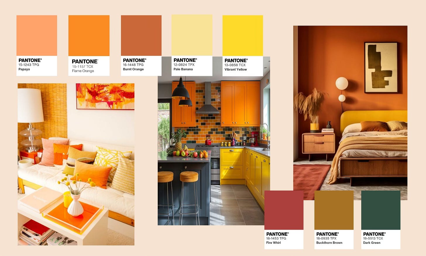
(Photo sources: Old Brand New, Hearth and Petals, home988)
This side of the color wheel is not just reserved for crisp autumn months. Orange and yellow can have their moment on display in your home all year round, with the potential to bring a variety of different vibes. What I like about this warm combo is its versatility. If you’re going for cozy and moody, opt for deeper, burnt shades. If you’re going for cheery and energizing, go for brighter and vibrant shades. You can even lean into pastels if you’re going for a softer, airier feeling. Accenting this analogous duo with reds, browns, and/or greens is a good way to add depth and balance.
2. Navy & Rose
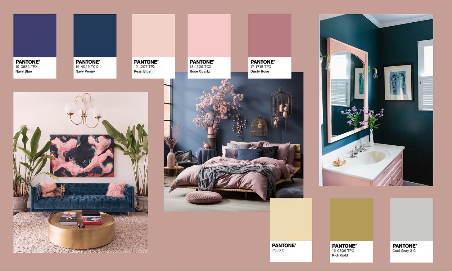
(Photo sources: Brit + Co, Haus und Gardentrends, Deepredtech)
While they’re not truly complementary colors, navy and rose were strong contenders for our bedroom color scheme thanks to their calming balance of masculine and feminine energy. Arguably a perfect pairing, rose pink’s light and airy vibe brings everything to the table that navy blue’s solemn and stormy aura does not. The rose’s brighter tones offer a fun, playful element to complement an otherwise solemn shade of blue, offering a modern and sophisticated approach to your home decor. Light gray, gold, or champagne colored accents can pull this pair together for an elegant, cohesive scheme that’s easy on the eyes.
3. Purple & Green
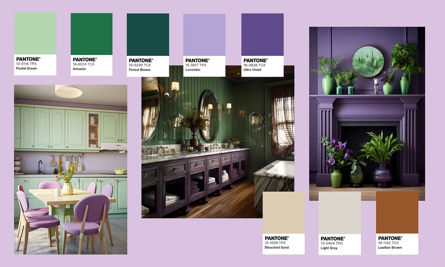
(Photo sources: Home Decor Bliss, Living Bright Interiors, Home Decor Bliss)
Green isn’t totally off limits in home decor and can be a foundational part of a fun and tasteful color scheme when approached with thought and intention. Green is opposite purple on the color wheel, making these two complimentary colors that bring out the best in each other when paired together. This color theory power couple work well together in a variety of hues, and they play nice with neutral accents like warm browns, cool grays, and light beiges. Gold details can also add some elegance and shine to spaces dressed in deeper purples and greens.
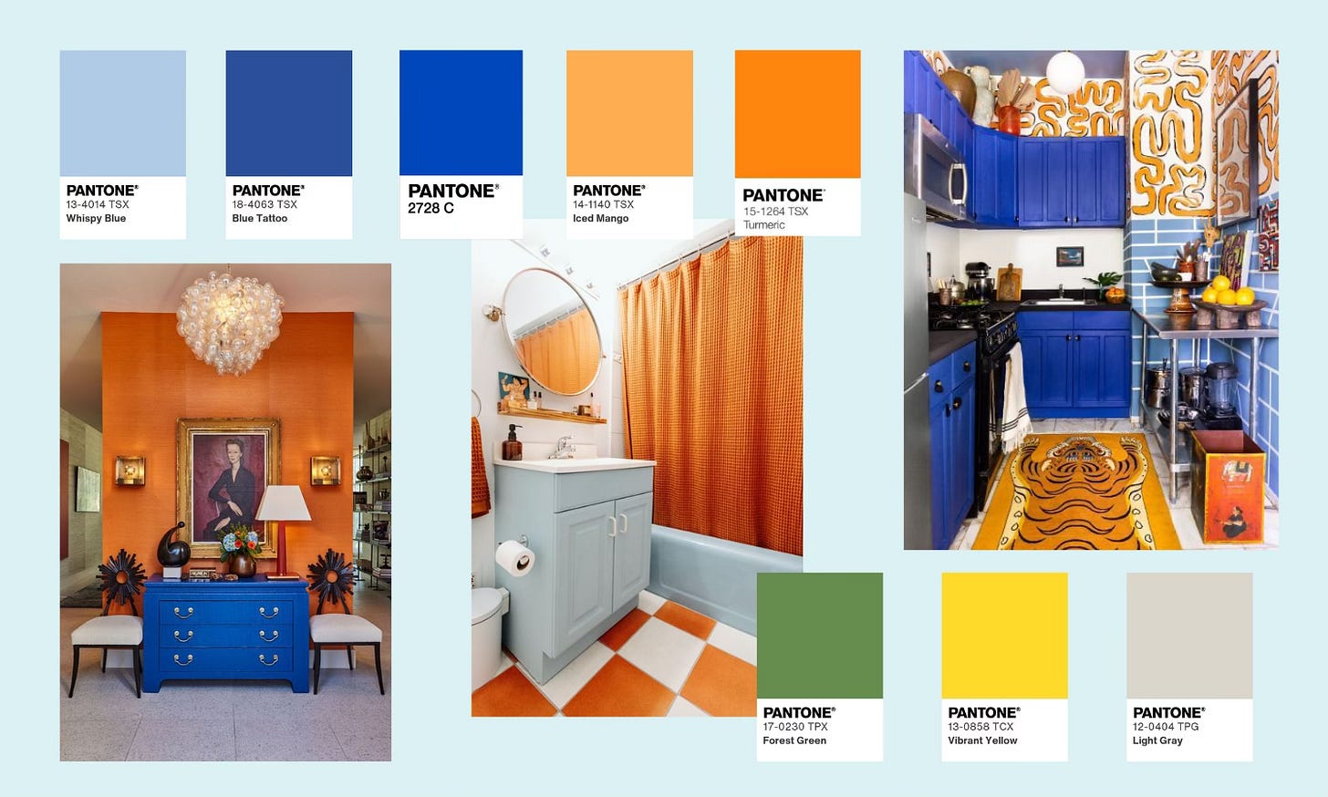
4. Blue & Orange
(Photo sources: Good Housekeeping, Apartment Therapy, Domino)
Another favorite complementary color couple, blue and orange bring bold, bright energy to interior spaces. With orange’s vibrant warmth and blue’s calming coolness, these two balance each other perfectly to give you the best of both worlds and ultimately put you at ease. Explore tone varieties to discover what shades are calling to you, and lean into greens, yellows, and light grays when picking accents to add even more character to this color scheme.
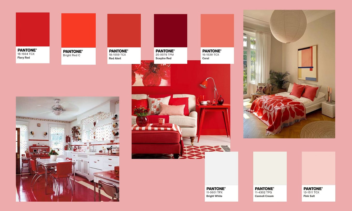
5. Red & White
(Photo sources: The Little Red Hen at Home, Decoholic, Coveteur)
With colors as classic as these, it’s impossible to go wrong. Powerful, vibrant, and timeless, red is a great choice to bring a pop of color to any room and is sure to grab the attention of its viewers. Red is also known to evoke feelings of romance, passion, strength, and courage, and white’s neutrality makes it a solid companion to balance red’s main character energy. Pair with other light neutrals or pink hues to add dimension to these stark shades.


